Intranet design is pretty stale; and most intranets tend to look alike. Intranet design isn’t the most imaginative business, but occasionally an innovator steps forth….
Enter IBM.
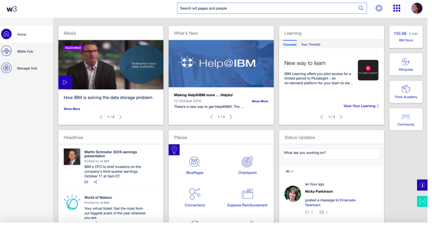
IBM undertook a ‘galactic’ intranet redesign a few years ago. In fact, it was a departure for Big Blue to undertake a new design that was very ‘Apple’ – very white and grey. However, the design wasn’t a huge hit with employees, and user satisfaction was lower than hoped.
USER ASSESSMENT
Employee surveys on the IBM intranet home page, called W3, found that satisfaction levels were dropping far too low for the intranet team’s liking: overall satisfaction had dipped to 67%, which meant in some geographies outside of the U.S. it was below 50%. Slow load times were also a frequent complaint of the 400,000 approximate users.
IBM took notice, undertook scads of additional user research, and rolled-out a bold, new, innovative design this past fall. Denoted as Project Butterfly – a broader initiative of which the intranet home page was one component, but also extended to a manager’s intranet hub, mobile apps for employees, etc. The redesign goal: make employees happier and more productive.
At the heart of the redesign though were a number of problems uncovered in the user research:
- Unavailable – the home page crashed too often (though available for more than 99% of the time, when it went down it was a big deal)
- Slow – slow download times
- Crowded – the home page was too busy
- Search – on an intranet with tens-of-millions of pages and documents, search results were underwhelming if not poor
- Mobile – more and more employees were logging onto the intranet via a mobile device, and finding the interface cumbersome
In other words, IBM took employee feedback to heart and really dove deep into the research to find out what employees really wanted.

“How it looks DOES matter,” says Jason Blackwell, Cognitive Psychologist & Human Factors Engineer, IBM Enterprise Web Solutions. “Waiting is not engaging. “Temporarily unavailable” is not engaging.”
The research also uncovered a finding that most take for granted – employees were mostly using the intranet to search (either the search engine, or the employee directory).
“A lot of what was inspiring the redesign was something really fast and stable, and improves all the spaces that most IBMers use,” says Blackwell. “Click data found 70% of home page activity was just searching. So we set out to learn their interests, work habits (and) predict their navigation / search needs.”
The IBM team turned their focus to a number of key priorities:
- Design – engaging design: build systems to audience, their needs, and tasks
- Cross-platform – mobile access and scalability for future mobile interactivity
- Social engagement – collaboration (social media) should not be a destination – engage with whom you need, when you need them.
- Speed – fast, resilient
- Personalization – intelligent, adaptive systems – build the workplace around the user
- Search – adapt and improve search
DESIGN
The new design is a dramatic departure from the typical portal design chalked full of content boxes and webparts. Instead, the new design deconstructs the portal box look, emphasizes the search engine front and center, and limits the remainder of the page to three lone columns for news and collaboration:
- News for all (everyone sees the same news)
- Your news (news personalized to the individual)
- Get connected
Read the full case study and see all the screenshots from the IBM intranet in the new, free whitepaper, Great Intranets: From Design to Social
- Cisco
- IBM
- Unisys
- DIRECTV

Pingback: IBM’s new intranet represents change in intranet design « Intranet Global Forum
Pingback: Intranet design is becoming more lightweight | Two Hives
Pingback: Intranet case studies | Intranet Blog