Information sources should never be designed solely by a creative designer, but rather an information architect, business analyst or content expert.
Twitter has unveiled a new design for its’ profile page: an underwhelming, and shallow design that crowds out desired information. See Twitter announces new profile pages, iPad app
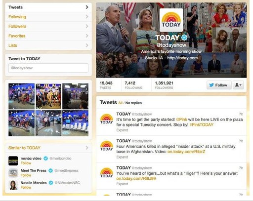
 Twitter’s new profile page design emphasizes pictures and design, and severely reduces the amount of content on the first screen (namely recent Tweets and profile information).
This sad, classic redesign faux pas where ‘design’ becomes the focus instead of the desired information or content is all too commonly committed by people who choose style over substance. Readers don’t use Twitter to be entertained by design and pictures, they use Twitter to be informed. Content is king, and always will be. It’s not to say there shouldn’t be pictures, of course there should be pictures and other multimedia, but content is the focus, not images. We primarily use Twitter to remain informed, not be entertained (a secondary consideration).
I’d give my right arm for a great graphic designer who understands that substance is more important than style.